Despite appearances, the ASX is close to as expensive as ever
There are two things that matter in terms of choosing a weight to Australian stocks in your portfolio. First, are stocks expensive overall. Then, are Australian stocks expensive relative to global valuations. I'm going to deal with the second problem today.
The simple version has Aussie stocks looking cheap. But it is wrong. Dig deeper and Australian stocks have rarely been this expensive relative to world counterparts.
How to make the ASX look cheap
I'm going to use forward price/earnings ratios for this analysis, but the numbers are similar for other valuation techniques.
At face value, the Australian stock market looks cheap relative to the world market. The ASX is currently trading on 14.7x earnings, which is cheaper than the world at 16.1x.
Then, if you look at the ASX / World as a ratio (>1 means the ASX is more expensive than the world and <1 means cheaper), you can see the ASX has tended to trade about 5% cheaper than the world. It is currently closer to 10% cheaper:
How composition has you fooled
The issue is with the composition of the Australian share market. Australia is heavily weighted to both banks and resources. Both of these sectors usually trade on cheaper multiples. For resources, it is because it has volatile revenues and even more volatile profits. For banks, the extreme leverage used increases the risk.
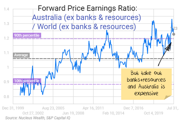
If you strip these sectors out and compare Australia excluding banks and resources, it no longer looks cheap. Actually, its well above the 90th percentile, close to as expensive relative to the world as it has ever been:
Then if you take Australian banks and compare them to world banks, it is even worse. Aussie banks are way more expensive than their global peers:
Resources are also more expensive than global peers, but not as extreme as the above:
If you look through the GICs sectors, Australia is in the top three most expensive for almost every vertical grouping:
Forward Price to Earnings ratio by region and sector
Recent Podcast
For more detail see our recent podcast on this topic:
Investment outcome
It may be the valuations are justified.
Maybe world economic growth will boom, and Australia will benefit through high commodity prices. But my bet is rising interest rates take that off the table.
Maybe an Australian economy with a globally high reliance on residential housing, extremely high personal debt levels and greater exposure to variable mortgage rates will weather the global housing price declines better than other markets. But I doubt it.
My interpretation is that Australia looks expensive relative to stocks in the rest of the world because it is an attractive market for global bulls. i.e. if you think world growth will continue to boom and commodity prices with them, Australia is where to play that theme.
If you are not of that view, and I certainly am not, then you probably should be looking to other markets for your equity exposure.
Calculation Postscript
The most frequent response I get to this is confusion... how can Australian P/Es when split into three parts each be above their world counterparts, but when you combine them they are lower than the world average??
Long story short, the maths is a lot like the maths for gerrymandering an election. Check the below if you want to play along at home:


