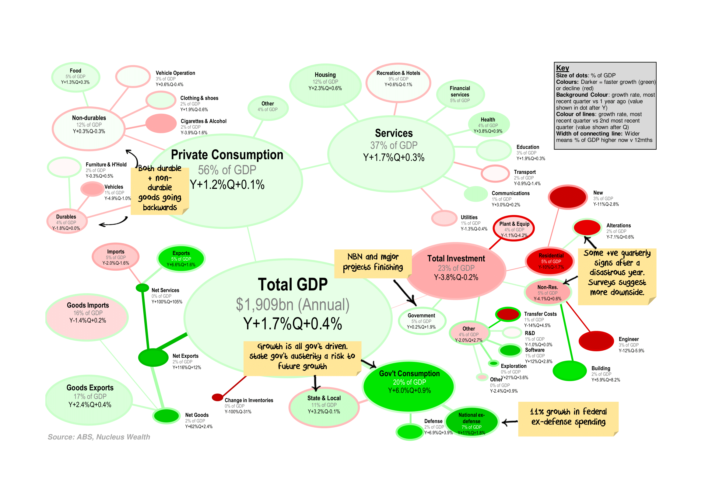
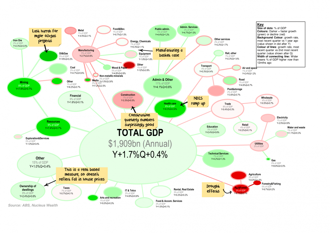
GDP Hotspots
Every quarter I like to look at the changes in Australian GDP and which categories are responsible for the growth / decline. Each bubble represents a category of GDP proportionate to its size, colours represent the growth rate.
Click the charts for a large version and commentary:

This quarter the key takeaways include:
- Federal Government spending (+11% for non-defence, 7% for defence over the year) the only thing keeping GDP above zero.
- Investment growth was not good, but I was expecting worse. Possibly there are green shoots, but capex surveys and investment forward indicators suggest there is still more downside.
- State & Local government spending has turned negative - with a low number of property transactions this is likely to remain a feature

.jpg)