The Illusion of Predictability in Today’s Market Valuations

I’ve been seeing a particular type of chart circulate more frequently: the one plotting the S&P 500’s forward price-to-earnings ratio against the market’s subsequent 10-year returns. At first glance, it looks authoritative — hundreds of data points neatly arranged, a strong downward relationship, and a clear takeaway that today’s high forward P/Es imply a lost decade ahead. For many, it feels like a reliable warning signal.
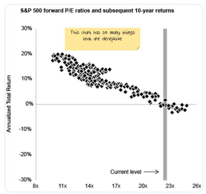
It might feel statistically powerful, yet the foundation underneath is much thinner than it appears.
The Overlapping Data Problem: Why These Charts Look Stronger Than They Are
We only have 30ish years of forward earnings data - I'm betting the above chart is around 30 x 12 monthly observations = 360 data points. Which sounds like enough.
These charts show what look like hundreds of independent observations between forward P/E levels and future returns. But in reality, most of the data points aren’t meaningfully independent. They cluster heavily around a handful of periods — especially the late-1990s dot-com bubble, which dominates the high-valuation region.
Each monthly point during that era (December 1999, January 2000, February 2000, etc.) shares almost the same subsequent 10-year return. The chart treats them as separate signals when they’re really just copies of the same outcome: the painful 2000–2010 decade.
It’s similar to stacking multiple overlapping photos of the same event and then trying to convince yourself it was a massive crowd. It looks dense, but it’s not diverse.
With so few independent cycles, the strong linear relationships in these charts dramatically overstate how well forward valuations can predict long-run outcomes.
What 125+ Years of Global Market History Actually Shows
Zooming out to more than a century of global market data reveals a much more stable pattern. Across the US, UK, Germany, Japan, and other developed markets — across wars, hyperinflation episodes, boom years, and long stagnations — equities tend to deliver 4.5–6.5% real returns. With current inflation levels, that equates to roughly 7–9% nominal.
Bonds typically produce 3–5.5% real, while cash trends lower still.
The difference between investments and speculative assets
Gold, art, coin, antiques, bitcoin share an important characteristic: they are scarce. It is a bet on whether other people want to buy them from you at a higher price.
The key difference is that stocks are productive assets. Their returns flow from the growth of underlying earnings, not from the willingness of the next person to pay more.
While stocks can turn into speculative assets for periods of time, there is not scarcity and so eventually they come back to the earnings or cashflow that they generate.
Where Equity Returns Really Come From
Over the past 40–50 years, S&P 500 earnings per share have grown roughly 6% nominal per year. Adjusted for inflation, real EPS growth has averaged 2–3%.
Long-run earnings growth break down into a few core components:
| Component | Contribution | Explanation |
|---|---|---|
| Inflation | ~2–3% | Companies have been adept at keeping pace with inflation |
| Real Pretax growth | +/-0.5% | Expansion of underlying business activity above inflation has been pretty minor, particularly in the post-buyback era. |
| Tax cuts | ~2–3% | Over the last 50 years, tax cuts have been a major source of earnings growth |
| Buybacks | ~2–3% | Shrinking share counts increase each shareholder’s claim on the above |
| Dividend yield | ~1.5–2% | Direct cash returns |
The Modern Impact of Buybacks
Buybacks became a major force only after legal barriers were removed in the 1980s. Before that, companies primarily returned cash through dividends. Today, many companies buy back 2–3% of their shares annually, effectively increasing each investor’s ownership without requiring reinvestment.
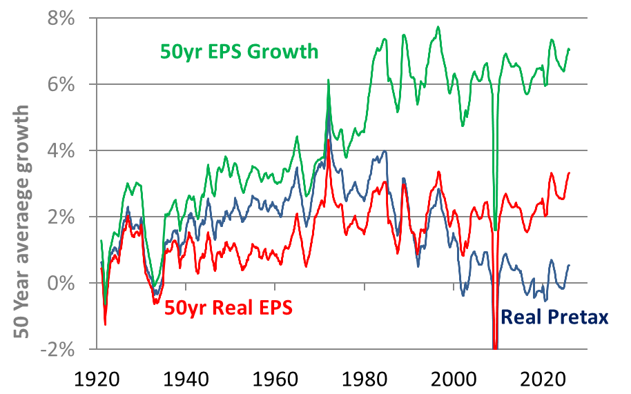
This shift explains why EPS growth appears stronger in recent decades. It’s not just businesses performing better — part of it is the math of shrinking the denominator.
Together, inflation (2–3%), buybacks (2–3%), and dividends (1.5–2%) put equities above 7% nominal return.Even if corporate tax cuts stop,real earnings are zero, and valuations go nowhere.
One way I like to think about it: companies absorb inflation for you, steadily increase your ownership share, and send you dividends along the way. Even if prices swing wildly, the fundamental engine keeps quietly running underneath.
Current Valuations: Global and Australian Markets
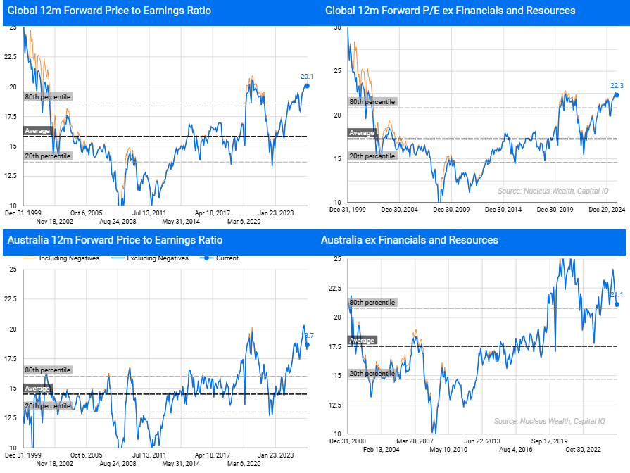
Global forward P/E ratios around 22 indicate elevated valuations, but still below the heights reached in the tech boom.
Valuations by Market Size: A Split Market
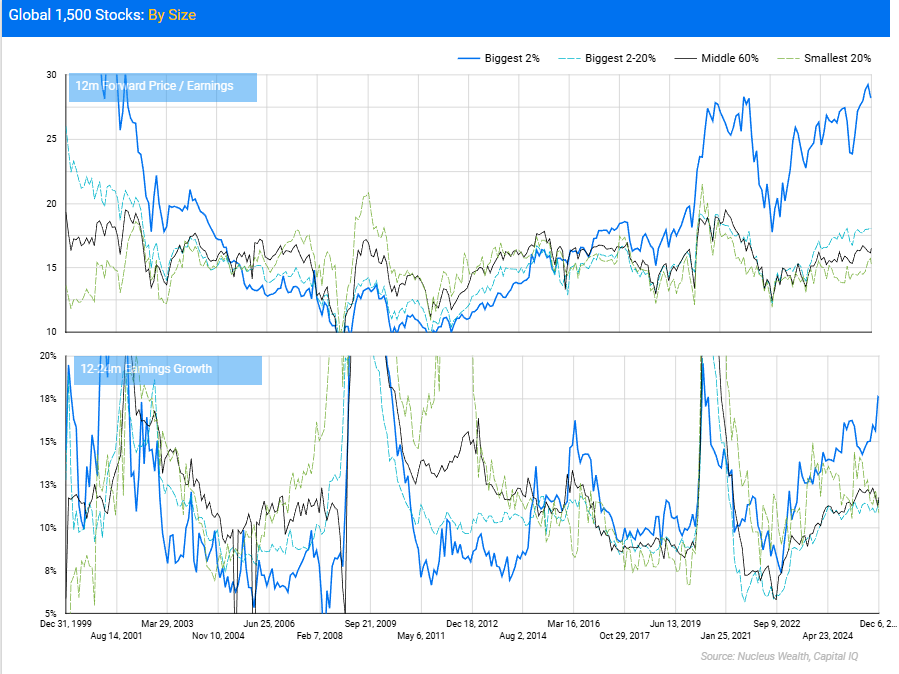
Looking across market capitalisations gives a clearer picture.
-
Top 2% of stocks (mega-caps) trade at 25–26x forward earnings — historically rich levels matched only in the tech bubble. Their near-term growth expectations are exceptionally high, largely driven by AI-related spending and demand.
-
2nd to 20th percentile: valuations sit close to long-term averages.
-
Middle 60%: around the 70th percentile — elevated but not extreme.
-
Smallest 20%: also near long-run norms.
The conclusion: the market is not uniformly expensive — a handful of giants dominate index-level valuations. Whether these valuations hold depends heavily on the duration and intensity of the AI investment cycle.
Sector Valuations: The Median Matters More Than the Average
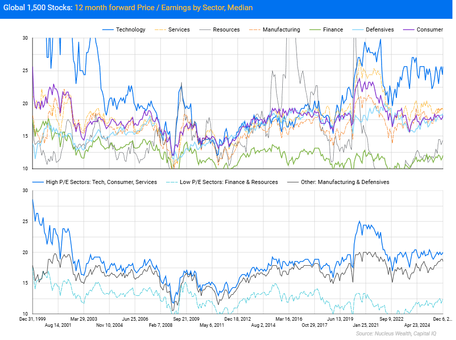
Looking at median valuations within sectors rather than averages reveals that most sectors sit close to historical norms. Technology is the outlier, with median valuations notably above long-term averages. Other sectors cluster near the middle of their historical ranges.
This reinforces that the valuation “problem” is concentrated, not broad-based.
Ten years is a long time. Maybe too long.
It is late 1998. A nascent tech boom is underway, spurred by the internet and year 2000 spending . Investors should be interested in how much people were paying for stocks in 1998.
But should you be judging the amount paid in 1998 versus the investment return from the financial crisis in 2008? Two stock market booms away?
Or to put it another way, the ten year chart is telling me to sell in 1998 because of the financial crisis coming in 2008. But to buy in 2005 (before that same crisis!) because returns up to 2015 are going to be great.
Long-term market behaviour is messy, resilient, and dominated far more by earnings growth, buybacks, and dividends than by short-term valuation timing. Valuations absolutely matter — but the fundamentals matter more.
And now the question remains: is the earnings growth in AI stocks worth the premium that the market is charging?