Quantifying the k-shaped recovery
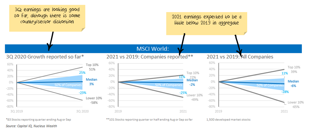
I have a working theory that the September quarter earnings (Q3) coming out over the next few weeks are going to give excellent insight to the new normal.
Q1 earnings were mostly pre-COVID. Q2 was in the middle of the lockdowns and so not representative. Q3 giving us our first clean(ish) look at what we can expect if current conditions continue.
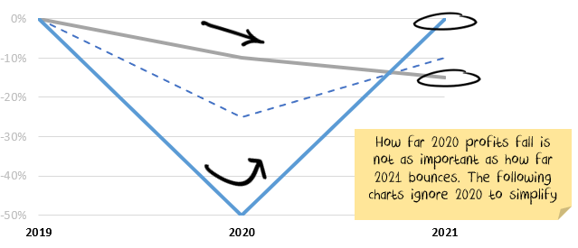
It isn't how far profits fall, it is how far they get back up
COVID has created some huge falls in profitability as economies shut down. That doesn't matter if the falls are temporary. Given the size of the percentage falls and rebounds, we find it more enlightening to ignore 2020 and look at the changes between 2019 and 2021.
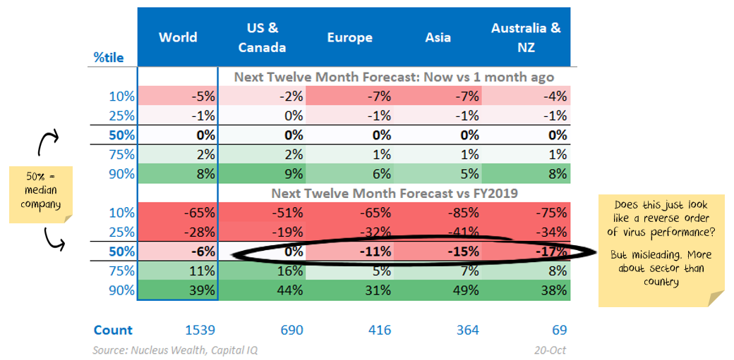
A "k" shaped recovery
The winning letter for the shape of the economic recovery seems to be "k".
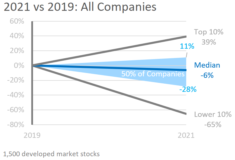
Half of the companies doing well and half doing badly. The stats support the theme:
At a regional level some interesting stats show up:
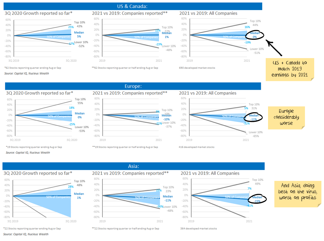
Inverse virus performance for profit rebound?
At an aggregate level, the performance by region actually seems to be the opposite of the virus performance. i.e. the more infected and the more dead, the sooner profits recover.
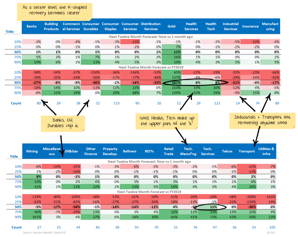
Industry performance is where the action is
Breaking the companies down by industry shows the error in the simplistic interpretation of the country data. The real difference between winners and losers is at the sector level.
The US has a much greater exposure to health and technology companies which are doing way better. The manufacturing and industrial companies which dominate some of the other regions populate the lower half of the k.
Finding value is still the problem
Companies where profits are looking the strongest also tend to be expensive. There are two main areas we are looking:
- Higher quality companies in the middle of the distribution with little downside. Some of these were left behind (from a value perspective) as markets swept higher and offer decent relative value.
- Stocks priced for an earnings disaster when the earnings are more likely to be "only" very bad. It is a more risky area of the market, but with many stocks priced for perfection, it is one of the few places left to find value.
Damien Klassen is Head of Investments at Nucleus Wealth.
Follow @DamienKlassen on Twitter or Linked In
The information on this blog contains general information and does not take into account your personal objectives, financial situation or needs. Past performance is not an indication of future performance. Damien Klassen is an authorised representative of Nucleus Wealth Management, a Corporate Authorised Representative of Nucleus Advice Pty Ltd - AFSL 515796.
Data info
In the above tables, we stick with large stocks. Only those in the MSCI index are included, about 1,600 globally, including the top 62 Australian stocks. Given how extreme the fall/bounce numbers are, we are looking at the numbers four different ways:
- Growth: comparing 3Q 2020 earnings vs 3Q 2019 earnings.
- Surprise: comparing 3Q 2020 earnings to the forecast one month prior.
- Revision: looking at how much the forecast for next year has changed over the last month.
- Vs 2019: comparing the forecast for next year vs 2019 earnings.
For context, here are some examples that reported early in the period:
- Darden Restaurants: 3Q earnings -59% vs 2019. 3Q earnings +1428% higher than expected a month ago. Forecast earnings have been revised +63% over last month. Forecast earnings are -16% vs 2019 earnings.
- NIKE: 3Q +10% vs 2019. 3Q +116% higher than expected a month ago. Forecast earnings revised up +28% over last month. Forecast earnings are +22% higher than 2019.
- Fedex: 3Q +60% vs 2019. 3Q +98% higher than expected a month ago. Forecast earnings revised up +40% over last month. Forecast earnings are the same as 2019.
.jpg)